Suji Lee

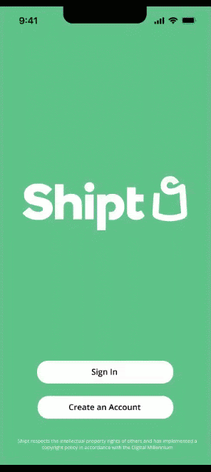
SHIPT
Redesign of Shipt delivery app to include Trader Joe's as their retailer with smoother checkout & delivery process
Role:
Lead UX Researcher
This project was completed through General Assembly's UX Immersive Program which had no affect on the actual Shipt app.

OVERVIEW
Owned by Target Corporation, Shipt is a grocery delivery application which has gained its success with more than 130 retailers. As it is continuing to work on expanding its services, Shipt is now offering their delivery service to Trader Joe's.
The UX team has been asked to include Trader Joe's as one of its retailers and feature the most popular grocery store items that can only be found at Trader Joe's to boost their company sales. Within the first year of it being available on Shipt app, the business' sales goal is to generate 3 million USD a month.
Business Problem: The business believes that consumers need a compelling reason to buy their grocery items through Shipt rather than from its competitors such as Instacart.
Consumer Problem: Consumers want their groceries to be delivered to their homes efficiently without any complications at low prices.
As we dove deeper into the problem of this application system, there were few aspects cosidered:
-
What are the popular products at Trader Joes'?
-
What are the pain points of ordering groceries online?
-
Where are the problems located throughout the app?
-
Why are the shopping carts abandoned?
DISCOVER
Before jumping into the design aspect of this project, we wanted to discover what the onsumers needed within the app but also keeping in mind of the business' needs as well. During this discover phase through research, we went through user interviews with task analysis and competitive & comparative analysis to get a better look at its competitors.
1. USER INTERVIEW & SYNTHESIS
In order to get a better understanding of what the consumers needed within a grocery delivery application, we gathered few users with different age groups to interview to gain more insight on their pain points as well as advantages of delivery apps. Through moderated Zoom interviews, we asked users to go into the Shipt app, search for toilet paper, and go through checkout process.
User 1:

Female
Age 20-25
Never used grocery
delivery app
User 2:

Male
Age 35-40
Uses Ralph's delivery app
User 3:
Male
Age 65+
Never used grocery
delivery app
KEY TRENDS
LIKES
PAINPOINTS

2. COMPETITIVE & COMPARATIVE ANALYSIS
Once we identified the key trends of the app during the interview, we looked through Shipt's competitors to look for what worked in each application system and what needed improvement. This will help us determine how to redesign this app to make it more user friendly and efficient than its competitors and yet, still intuitive.
COMPETITIVE

INSTACART
-
App only allows checkout once you sign-in or create an account which leads to users abandoning their carts
-
Mobile version also lets you checkout once signed-in or create an account
-
Confusing categories especially if you don't know the exact item you are looking for


AMAZON FRESH
-
App only allows checkout once you sign-in or create an account
-
Need to click on item to see if available near you rather than showing list of items available to be delivered
-
If item is not available, tells you to pick up item instead but pick-up option is nowhere to be found on the app
-
Categories are confusing because items are picked for promotion

COMPARATIVE
-
App allows checkout without creating an account
-
Videos in the app seems to be very hectic and distracting
-
Home page has featured items which can help promote items

ADIDAS
CHIPOTLE
-
App allows checkout without creating an account
-
Photos of food items are helpful for users to pick and choose
-
Cart at checkout has options to add/edit food items
-
Only focuses on food orders

DEFINE
Once we gathered different trends throughout the research process, we began creating our persona based on our interview findings, a retrospective user journey map highlighting the user journey on the current Shipt app, two problem statements, and how might we (how we will help the business reach their goals and mitigate user's pain points).
1. PERSONA: JUSTIN MILLS
From our user interviews, we put together a persona to highlight the key trends that we found. Using affinity mapping, we came up with our persona, Justin Mills.
WHO IS JUSTIN?
Single father of 2 sons
Works from home to be present for his sons

PAIN POINTS:
Create account to checkout
Limited delivery locations
Pick up locations are too far
Need items delivered earlier
"I feel like these delivery apps are trying to sell themselves all at once rather than trying to help me and my needs."

2. RETROSPECTIVE JOURNEY MAP
We used task analysis to go through the Shipt app to really dig deep into why the users and our interviewees had hard time navigating through. Below, you will see our retrospective journey map that shows the process of ordering groceries through the app and to to observe the main pain points and the ease of navigation throughout the checkout process.

3. PROBLEM STATEMENT
Once our personas and journey maps were created, we gathered all key trends to create 2 overarching problem statement to meet the business' and consumer's needs:
Shipt wants to add Trader Joe's to their delivery app in order for customers to use their app over its competitors so that they can boost their company sales within a year offering items that are only exclusive on their app.
Users need Shipt to deliver groceries to their home from Trader Joe's so that they can receive their groceries on time with reasonable prices without any complications.
4. HOW MIGHT WE...
As we dug deeper into our problem statements for both the business and the consumers, we developed few How Might We statements in order to set goals for our redesign.
How might we find a way to deliver groceries at the time requested?
How might we offer different options for replacements items if sold out?
How might we use Shipt to allow users to checkout efficiently without abandoning their carts?
How might we promote Trader Joes' popular products in order to attract more customers?
DEVELOP
As we moved into the develop phase of this project, we came up with user flows to meet the goals of the business and the consumers, mid-fi wireframe, conducted usability test and moved forward with synthesis & revisions and creating a final hi-fi prototype.
1. USER FLOWS
We analyzed the key commonalities of our competitive & comparative analysis as well as the results from our interviews to create a possible User Flow with tasks to be completed in order to determine how our users will be able to navigate through the app with least pain points.
FLOW 1: ORDER GROCERIES TO BE DELIVERED

FLOW 2: CREATE AN ACCOUNT

FLOW 3: SEARCH FOR TRENDING PRODUCT & ADD TO CART

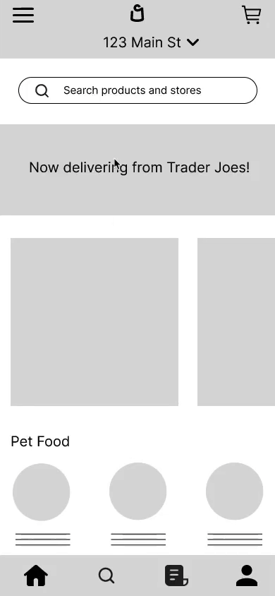
2. MID-FI WIREFRAME
Once the user flows were created, we went ahead and created a mid-fi wireframe prototype which included the key trends from our findings and what we wanted the users to test out. This was used to test the usability of this app.
SOLUTION #1:
Added Trader Joe's as one of Shipt's retailers
SOLUTION #2:
Created "Orders" page to efficiently reorder previously purchased items
SOLUTION #3:
Added Trader Joe's popular item: Daily Facial Sunscreen


3. MID-FI USABILITY TEST
We gathered 4 participants to test out our wireframe prototype. We wanted to make sure that the flow was familiar without any pain points for the users throughout the navigation of the app. We asked the participants to test out the 3 key tasks as shown below.

3 FEMALE

1 MALE
AGE RANGE 18-44
TEST FORMAT: MAZE


TASK #1: SEARCH FOR TRADER JOES'S DAILY FACIAL SUNSCREEN

DIRECT SUCCESS:
25% of testers were able to get through the task directly as intended
INDIRECT SUCCESS:
25% of testers were able to get through the task indirectly taking a detour but still succeeded
GIVE UP:
50% of testers couldn't get through the task and gave up
OBSERVATION: From the heat map, we noticed that the commonalities were that the testers were clicking on the "search" functions (search bar and search icon), especially because they expected to type into the search bar.
TASK #2: PURCHASE TRADER JOES'S DAILY FACIAL SUNSCREEN AND HAVE IT DELIVERED
DIRECT SUCCESS:
100% of testers were able to get through the task directly as intended
OBSERVATION: From the heat map, we noticed that the testers tried clicking on the "checkout" button but the button that leads to the next page is the "total" button. This was the main pain point for the testers because they assumed the "checkout" button will work.

TASK #3: DUPLICATE YOUR PREVIOUS ORDER AND HAVE IT DELIVERED

DIRECT SUCCESS:
66.7% of testers were able to get through the task directly as intended
INDIRECT SUCCESS:
33.3% of testers were able to get through the task indirectly taking a detour but still succeeded
OBSERVATION: From the heat map, we noticed that the testers were able to get through the task directly but faced the same problem as they did during the second task when trying to click the "checkout" button.
TEST RESULT FINDINGS
Once the usability tests were complete, we asked the testers few questions about their experience with the prototype.
TESTER 1:
“My main pain point was, I lost the threading between the cart page (or where the tab said $xx.xx) to the checkout. Intuitively I selected the tab to the next of it. “
TESTER 2:
"I love the repeat order option. Incredibly user friendly and customer focused. My main pain point was more around the instructions than the actual prototype. I misunderstood the first task and it wasn't clear how to complete (at first)."
TESTER 3:
"Checkout button was unclear for both tasks. I wasn't able to remember after using it once that the checkout button was different."

4. SYNTHESIS & ITERATION
With the reworking of the "checkout" button in mind, we created a high-fi prototype of the SHIPT application focusing on Trader Joe's. We gathered different 3 participants to test the usability of the improved app with all the changes applied. We took this time to conduct a moderated test via Zoom so that we can observe the testers and hear their thoughts as they go through the navigation.
2 FEMALE
1 MALE
AGE RANGE 23-64
TEST FORMAT: MODERATED ON ZOOM


Once the usability tests were complete, we asked the testers few questions about their experience with the high-fi prototype. Below are some comments from our testers.

OBSERVATION 1: The testers were able to get through the app and complete all the tasks. Some common thoughts they had was the fact that there were no sticky header/footer on the app. Testers wanted the header/footer to be visible throughout their shopping experience as well as their carts being visible at the top.

OBSERVATION 2: The testers commented that the texts and buttons were hard to read.

OBSERVATION 3: The testers found it confusing that under their accounts, it says "Your Orders" as opposed to "My Orders".